Layered Poster Series
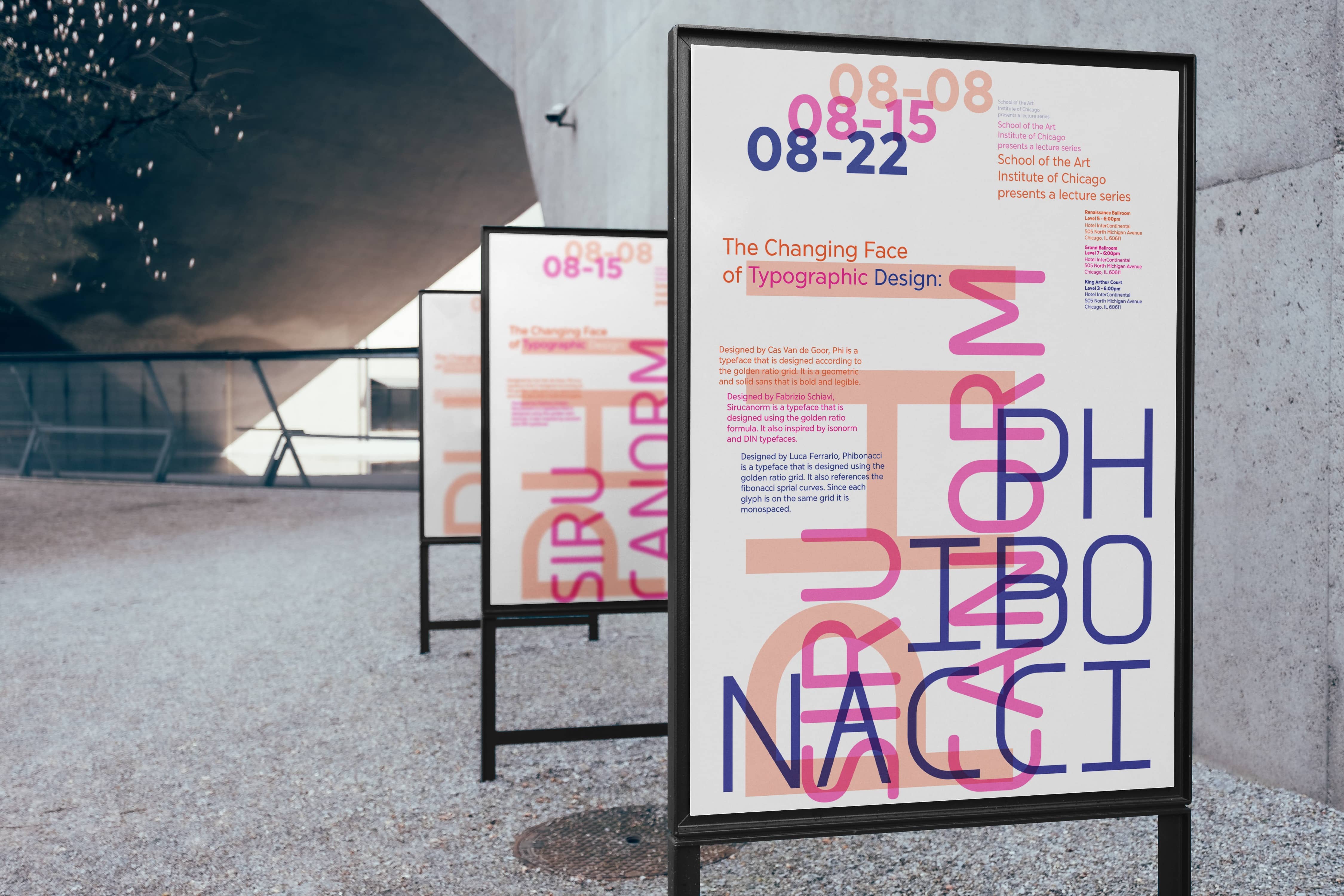
Layered Poster Series Inspired by the Fibonacci Sequence
2024
10 x 16.18
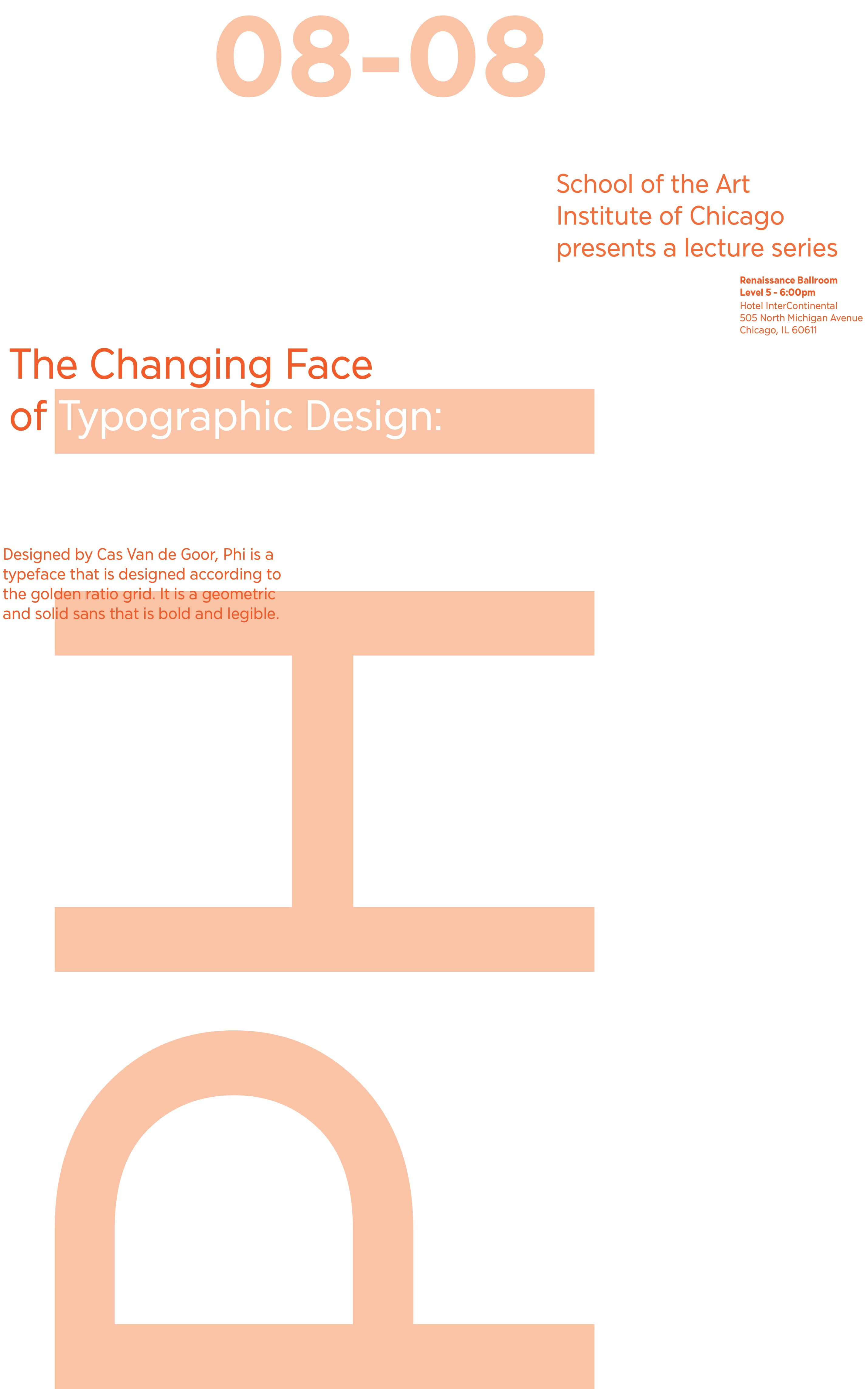
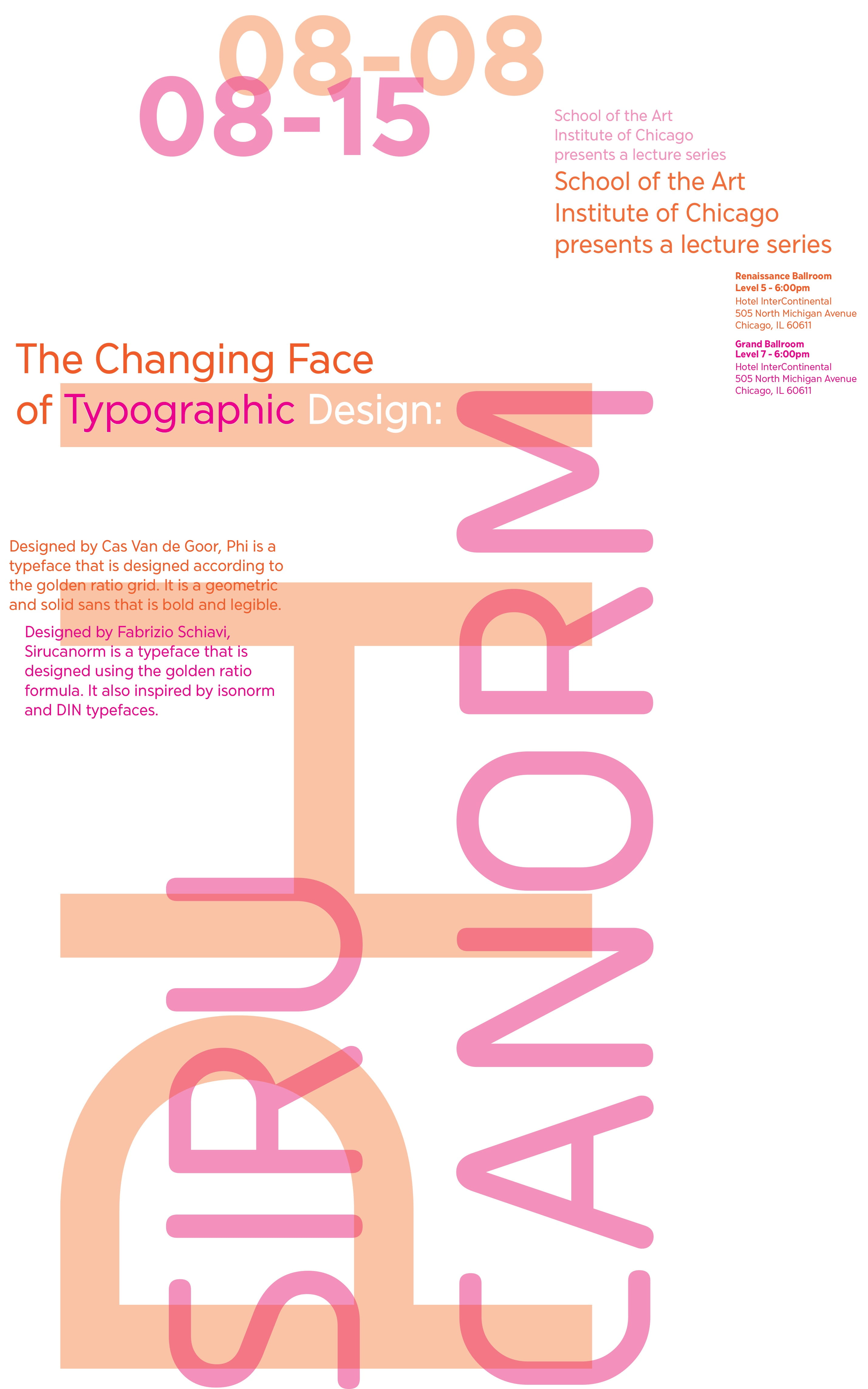
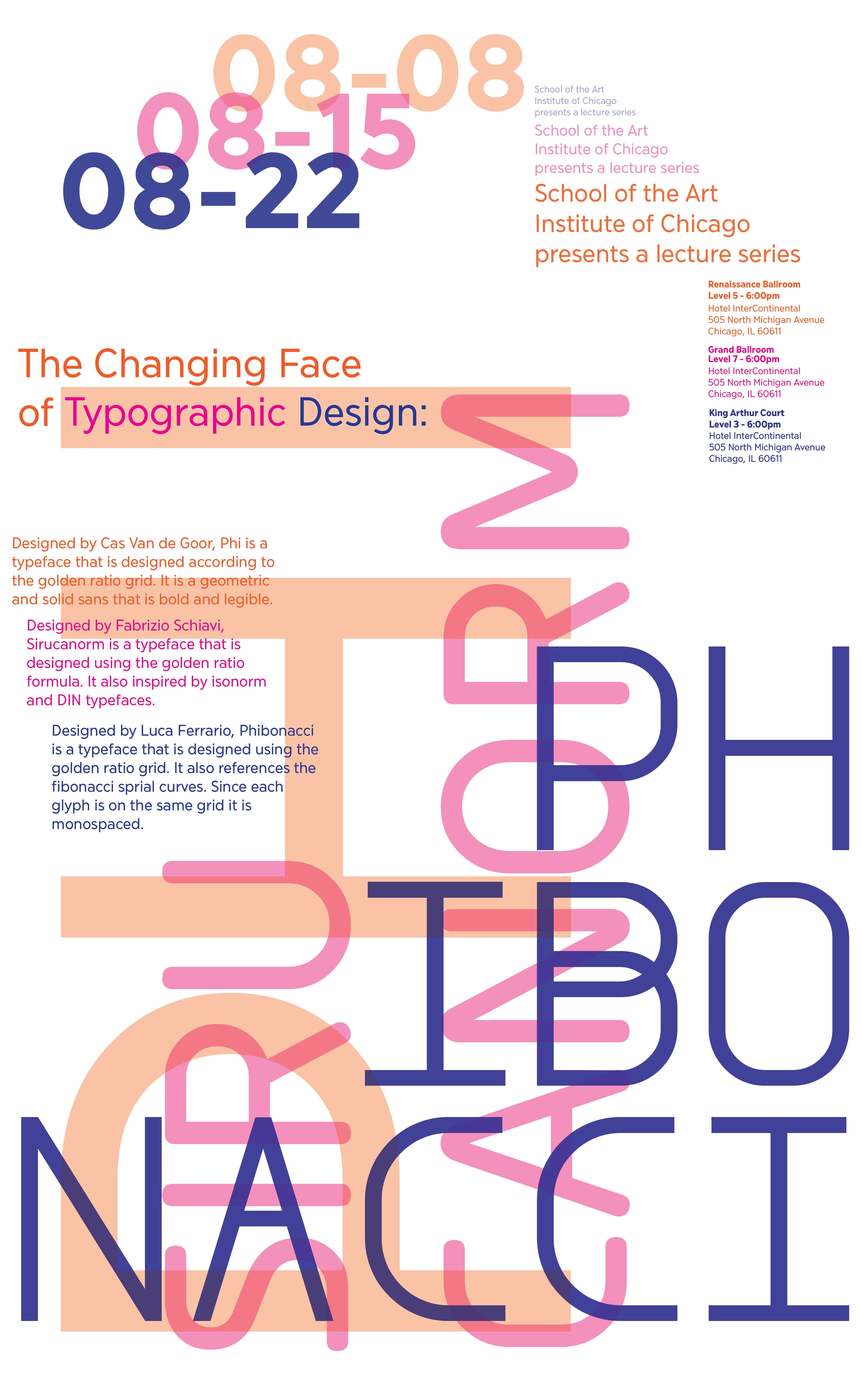
This project is themed around the Fibonacci Sequence and building with typographic shapes. The challenge was to find three typefaces and put them in conversation with eachother to make a series of posters that advertises for a lecture on typography. The three typefaces that I chose are:
Phi - a typeface that is designed according to the golden ratio grid. It is a geometric and solid sans that is bold and legible. Designed by Cas Van de Goor.
Sirucanorm - a typeface that is designed using the golden ratio formula. It also inspired by isonorm and DIN typefaces. Designed by Fabrizio Schiavi.
Phibonacci - a typeface that is designed using the golden ratio grid. It also references the fibonacci sprial curves. Since each glyph is on the same grid it is monospaced. Designed by Luca Ferrario.
Since the typefaces are heavily influenced by the golden ratio, I wanted to bring that into every other aspect of the posters that I could. I chose the size based on the golden ratio and used a fibonacci grid to guide the placement of the elements. The type placement and size mimmicks the spiral. I also limited myself to fontsizes that are in the sequence.
0,0,1,2,3,5,8,13,21,34,55,89,144,233,377,610,...