Goose Island: Summer Rebrand
Goose Island Summer Rebrand - Practice Project
2026
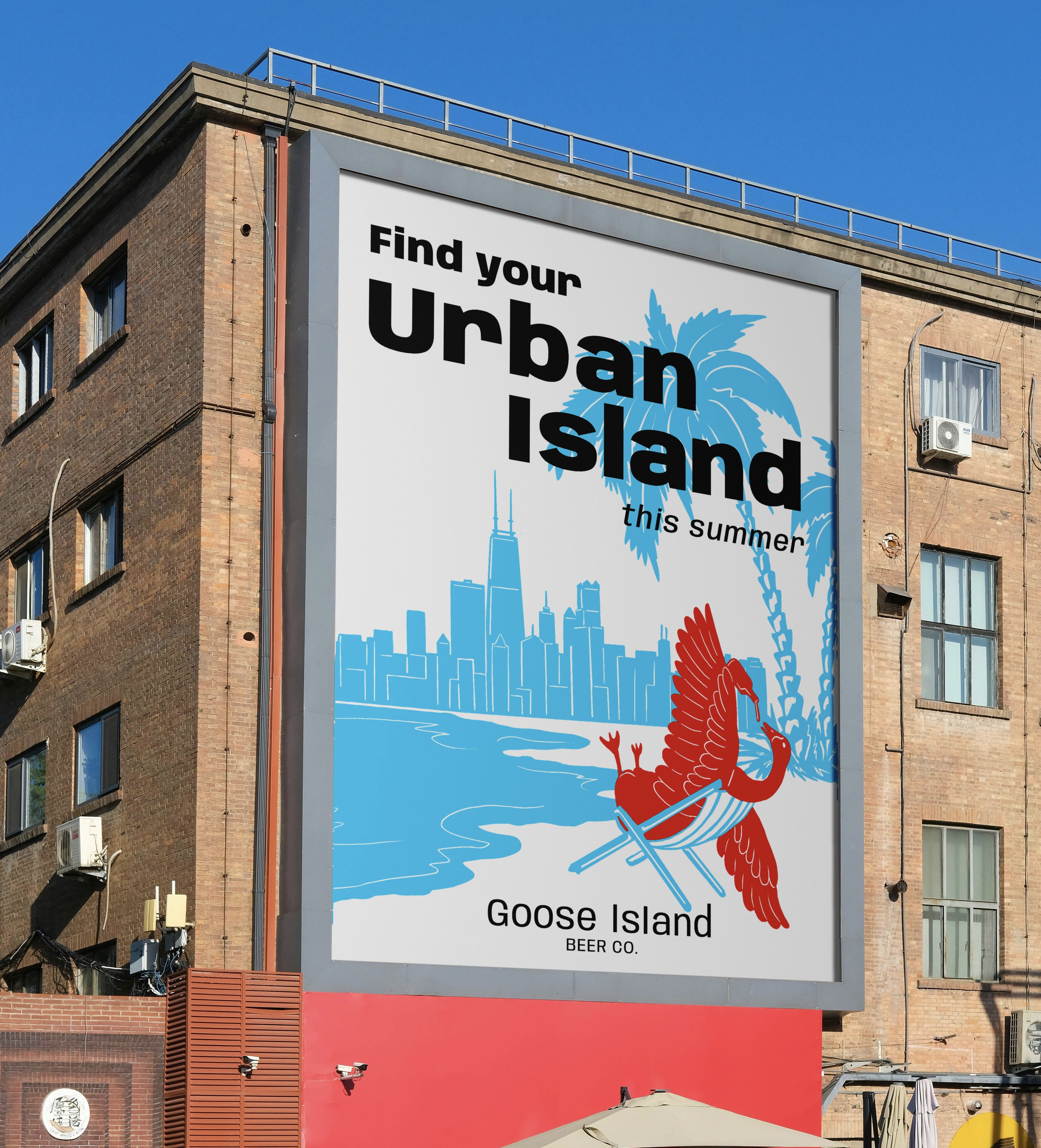
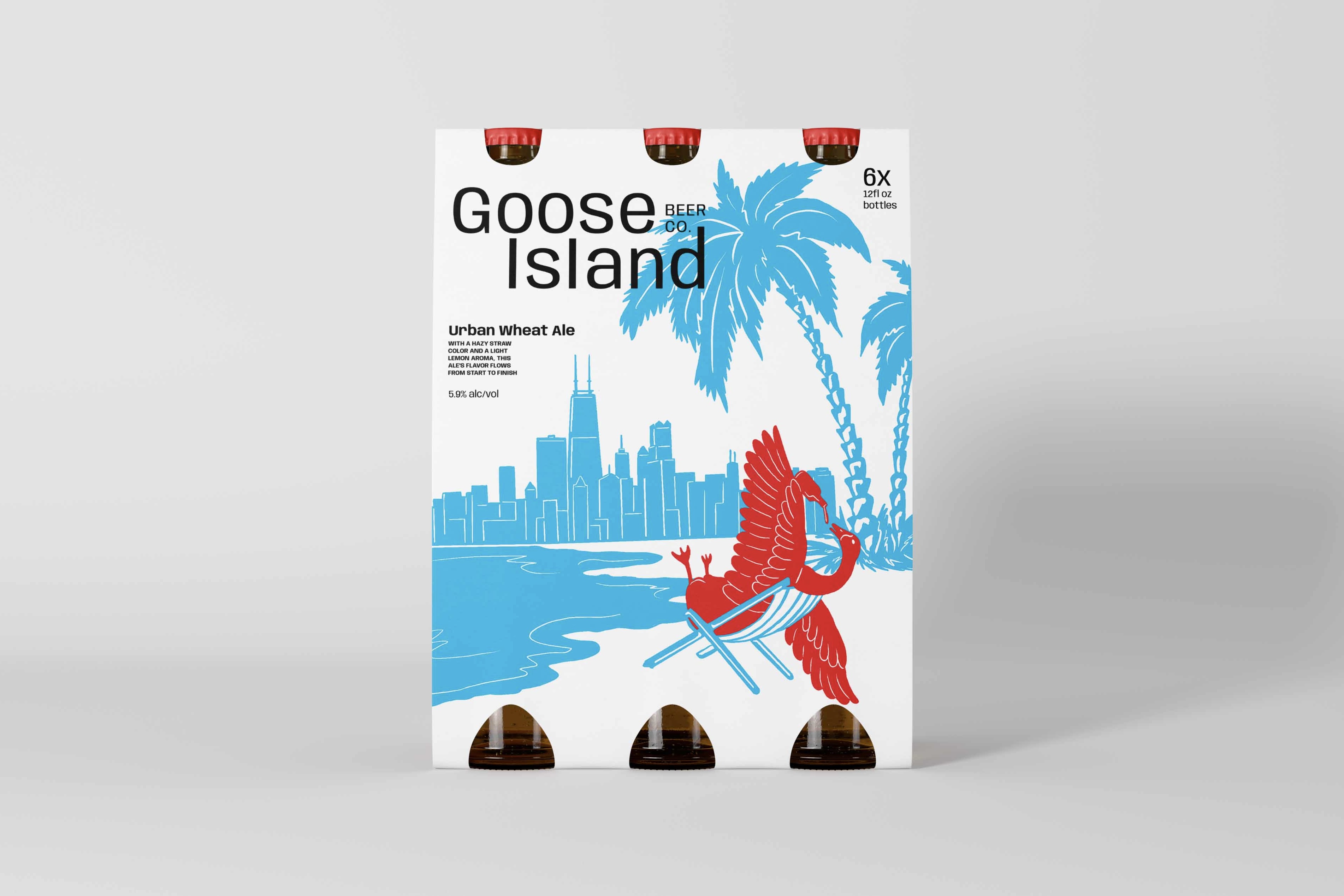
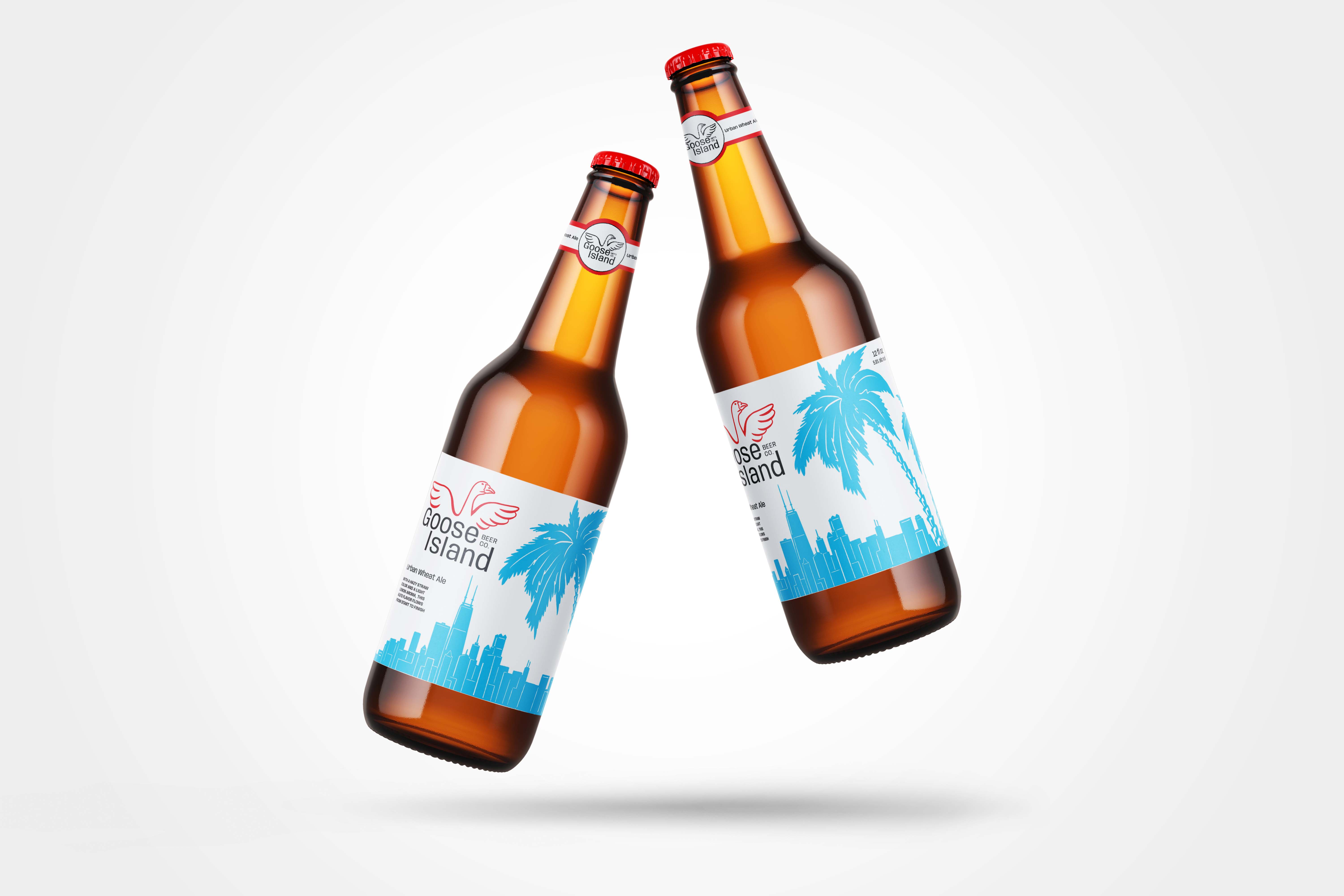
This project explores a lighter summertime take on Chicago's iconic Goose Island beer/brewing company brand. It features bright colors inspired by Chicago's flag and the light heartedness of warmer months. It plays on the idea of finding your oasis in the city, especially since Chicago has beaches along lake Michigan which feature a view of the skyline as well as the water.
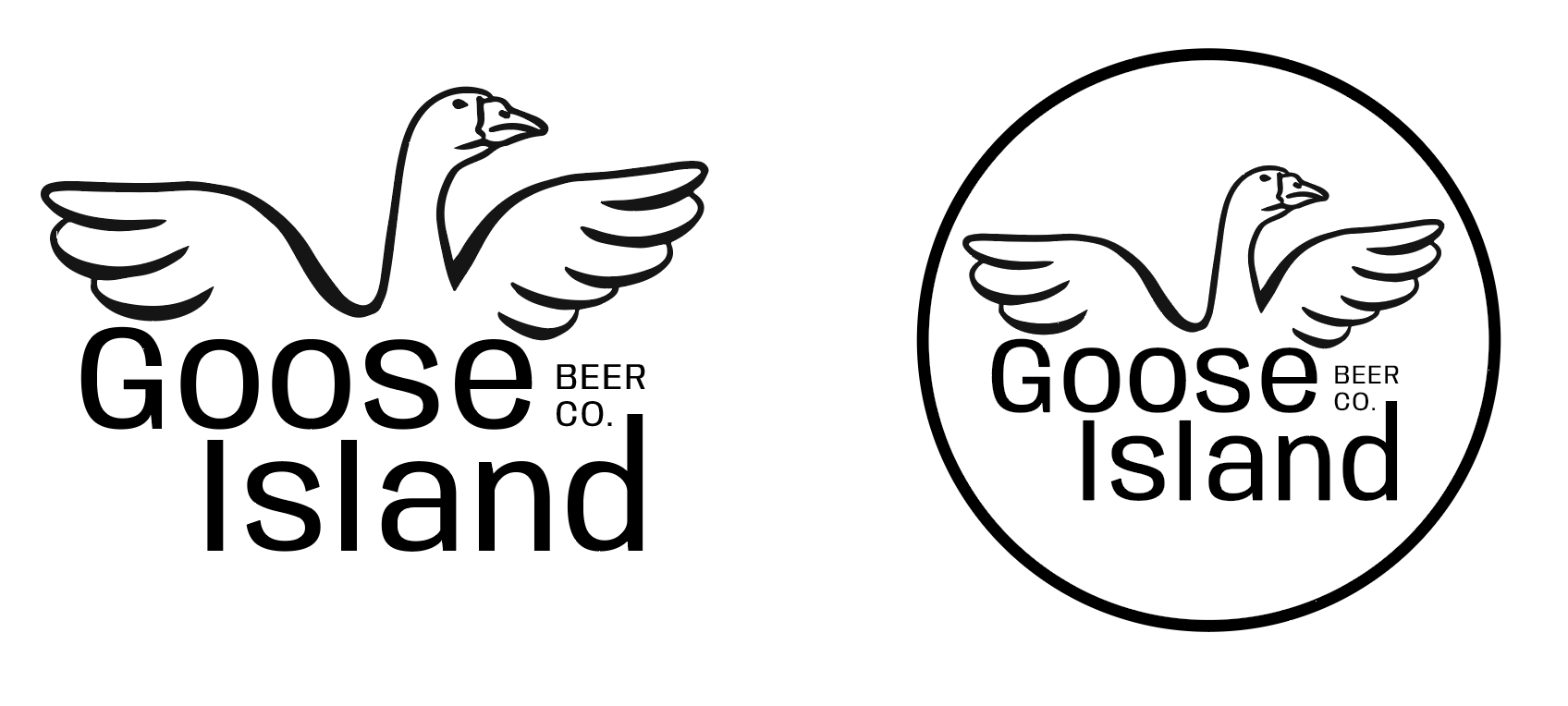
The logo was reworked to be crisp and clean while still featuring the goose mascot.
The typeface used on the logo and other materials is Anybody from Google Fonts.