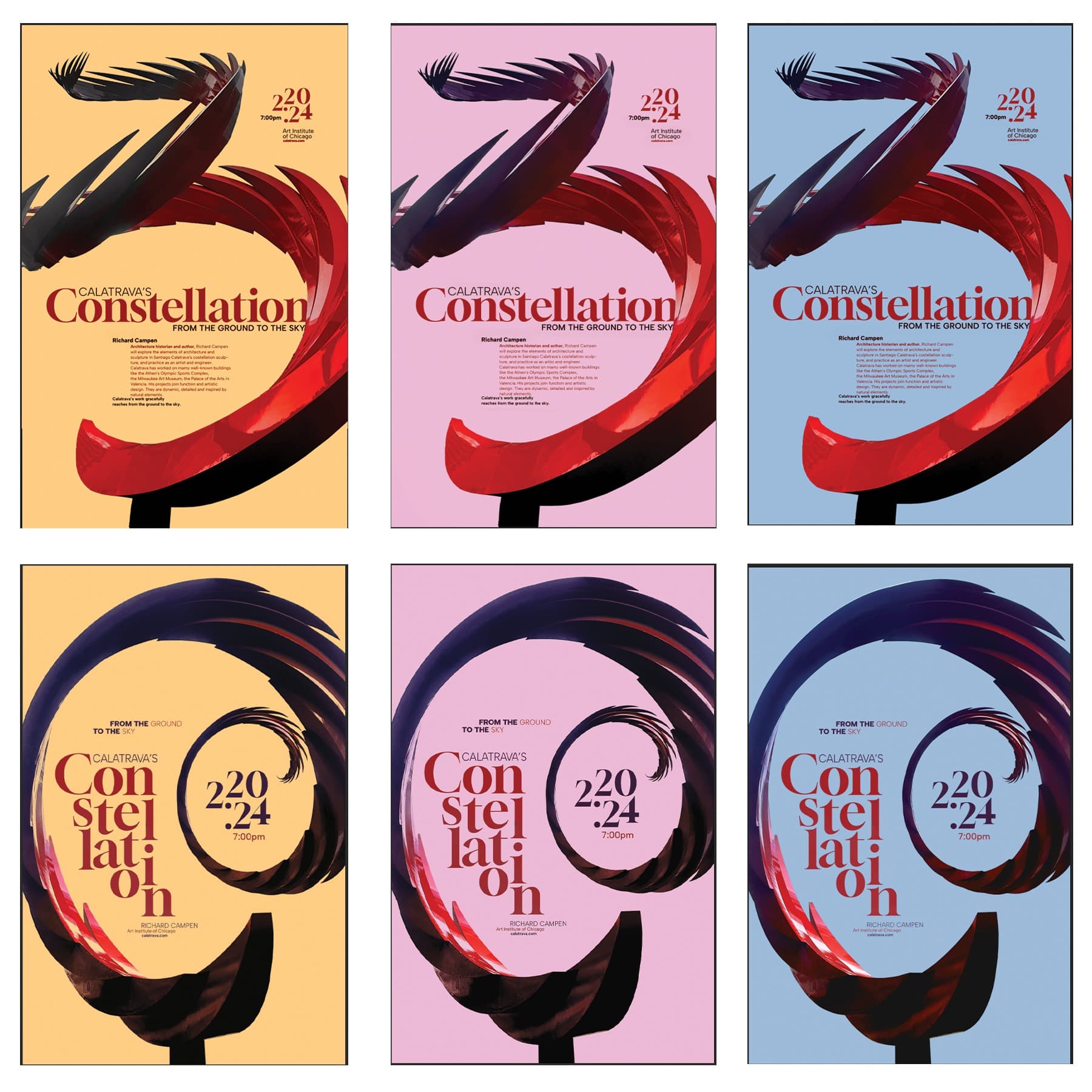
Artist Lecture Poster
Artist Lecture Poster for Santiago Calatrava's Constellation Sculpture
2023
11 x 17
Combining photography and typographic language.
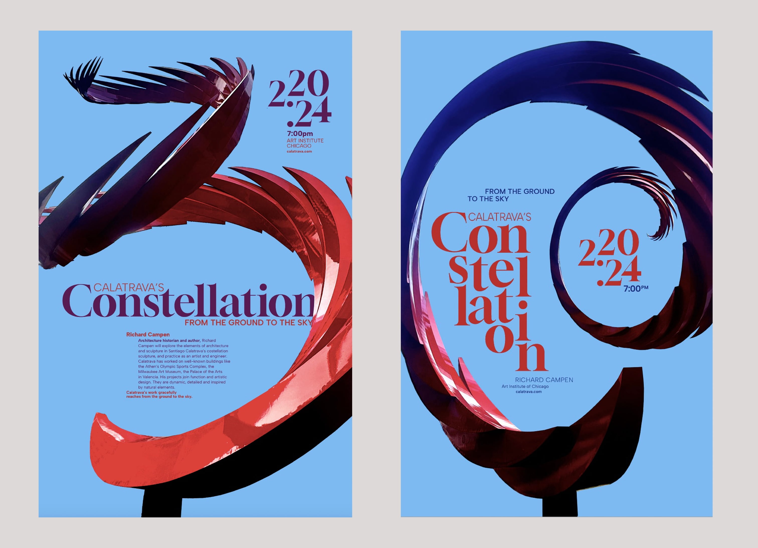
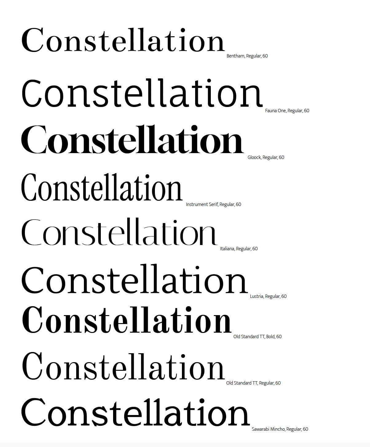
This project explores how typography can echo and extend the visual language of sculpture. Centered on Santiago Calatrava’s public artwork Constellation, the lecture poster investigates the relationship between form, rhythm, and structure in both three-dimensional space and letterforms. The typeface Glook was selected for its dynamic contrast, pairing strong, thick strokes with delicate, wispy lines that mirror the sculpture’s sweeping arcs and tensile gestures. By aligning typographic weight, movement, and negative space with the physical qualities of Constellation, the poster treats type not as a neutral carrier of information, but as an active visual partner to the artwork. The result is a cohesive dialogue between text and sculpture, where each reinforces the other’s sense of balance, motion, and expressive force.
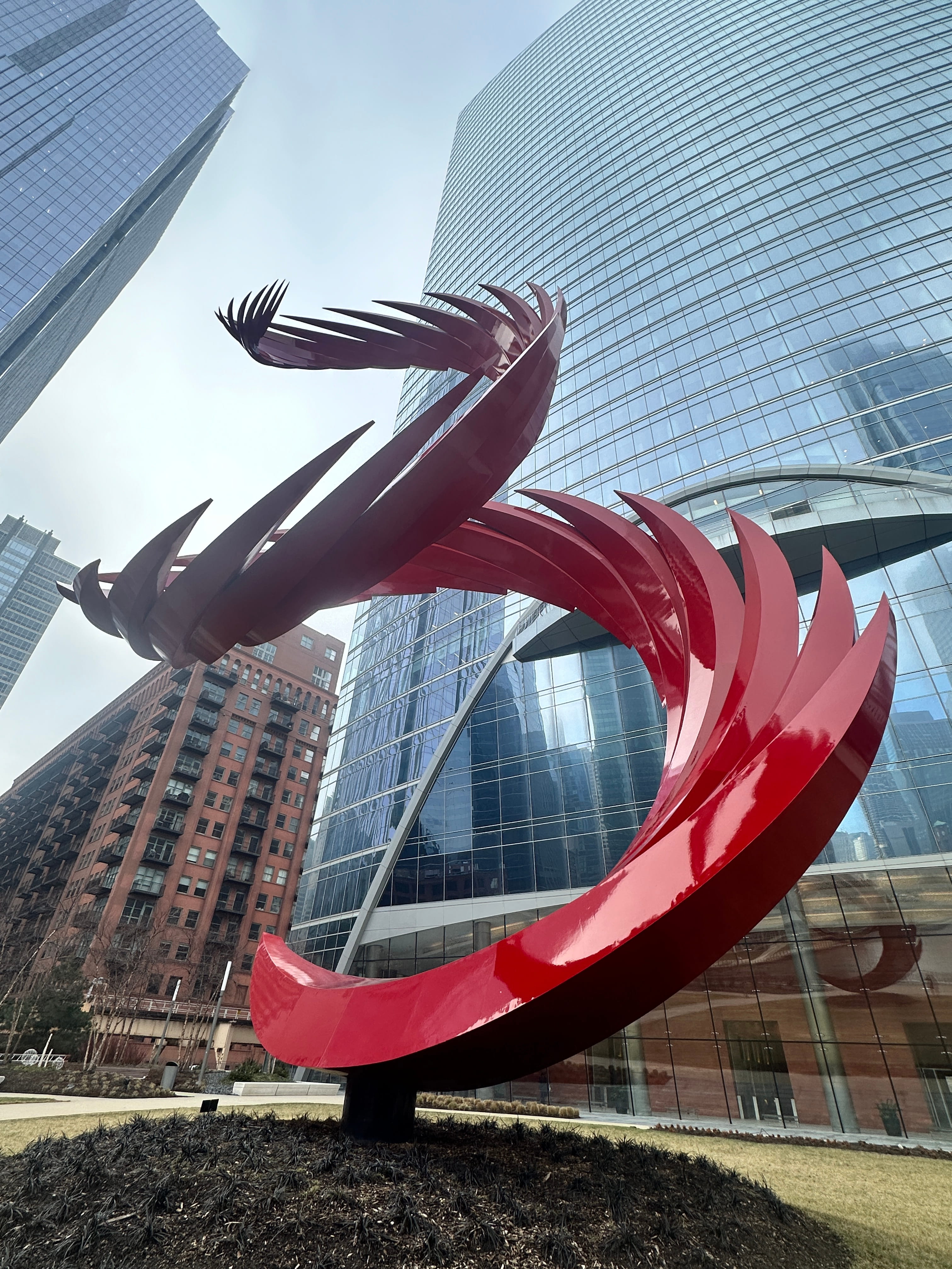
I visited the sculpture and took images to use for the posters. I appreciate how the sculpture transforms based on the angle that the photograph is taken from. The sculpture is a bright red and I love how it meets the blue sky which influenced my final color choices.
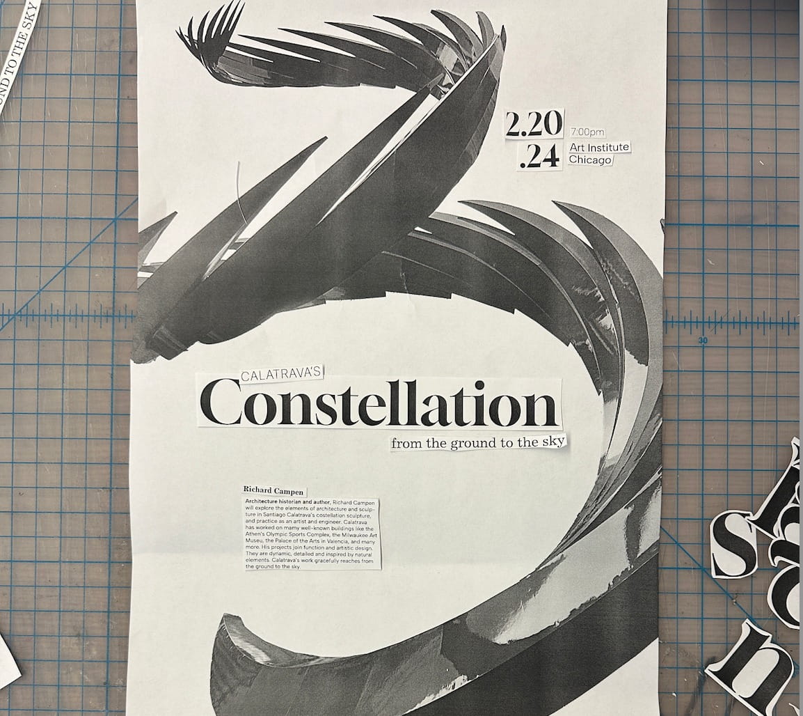
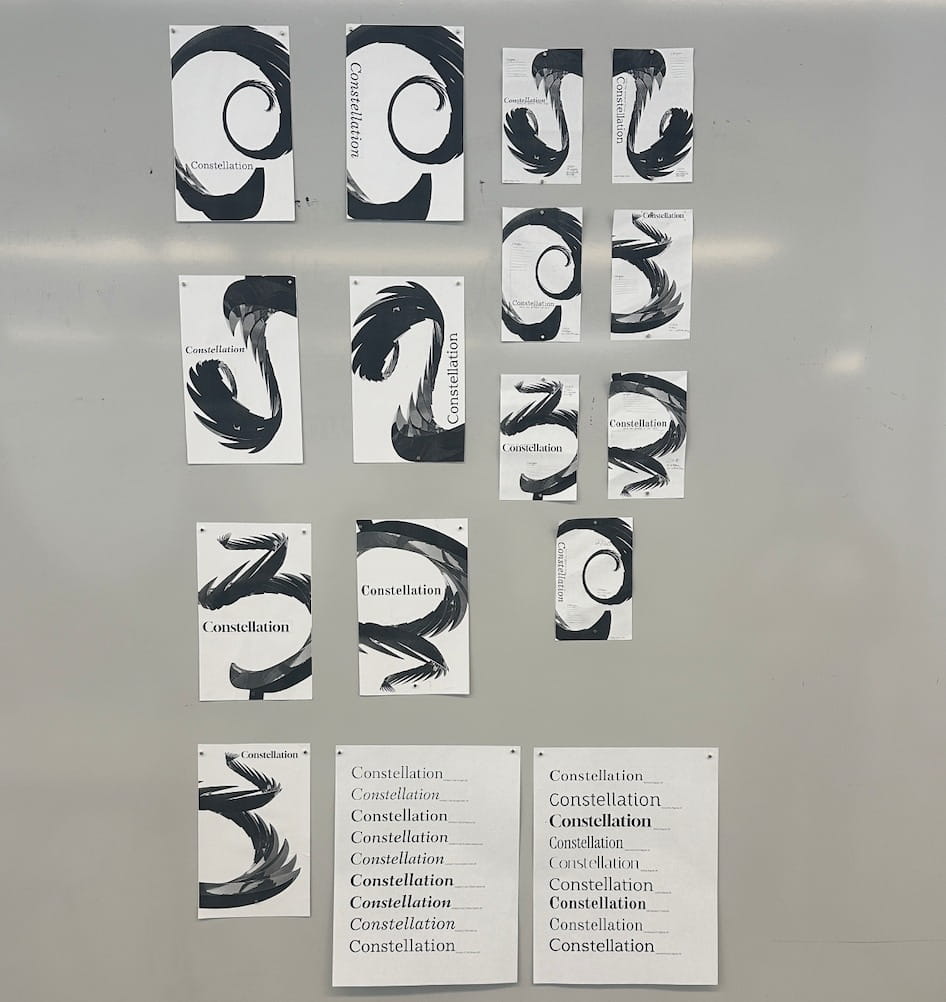
I used a physical paste-up technique to generate compositions that further push the connection between type and image. Paste up is a process that allows a designer to be free, experimental, and time efficient. It allowed me to create and try many different combinations then land on one to create digitally and refine.